

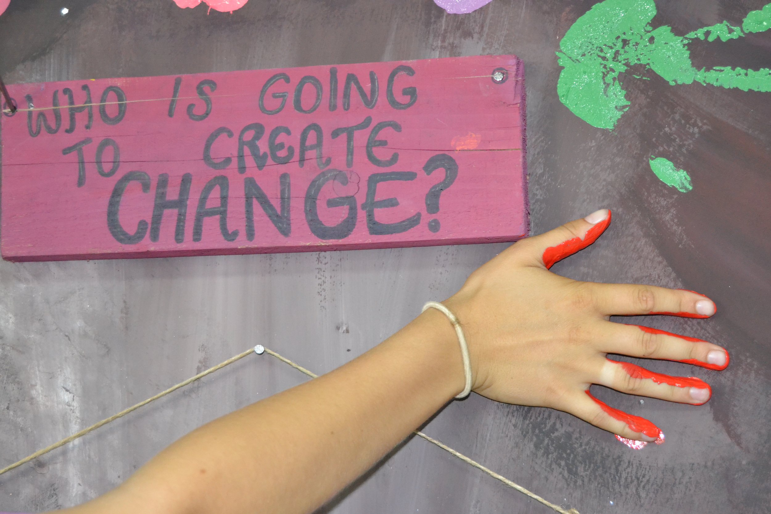
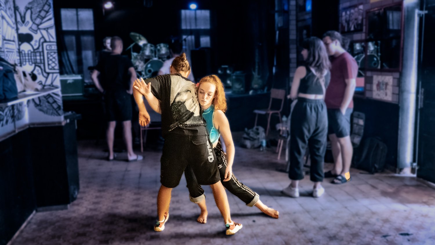
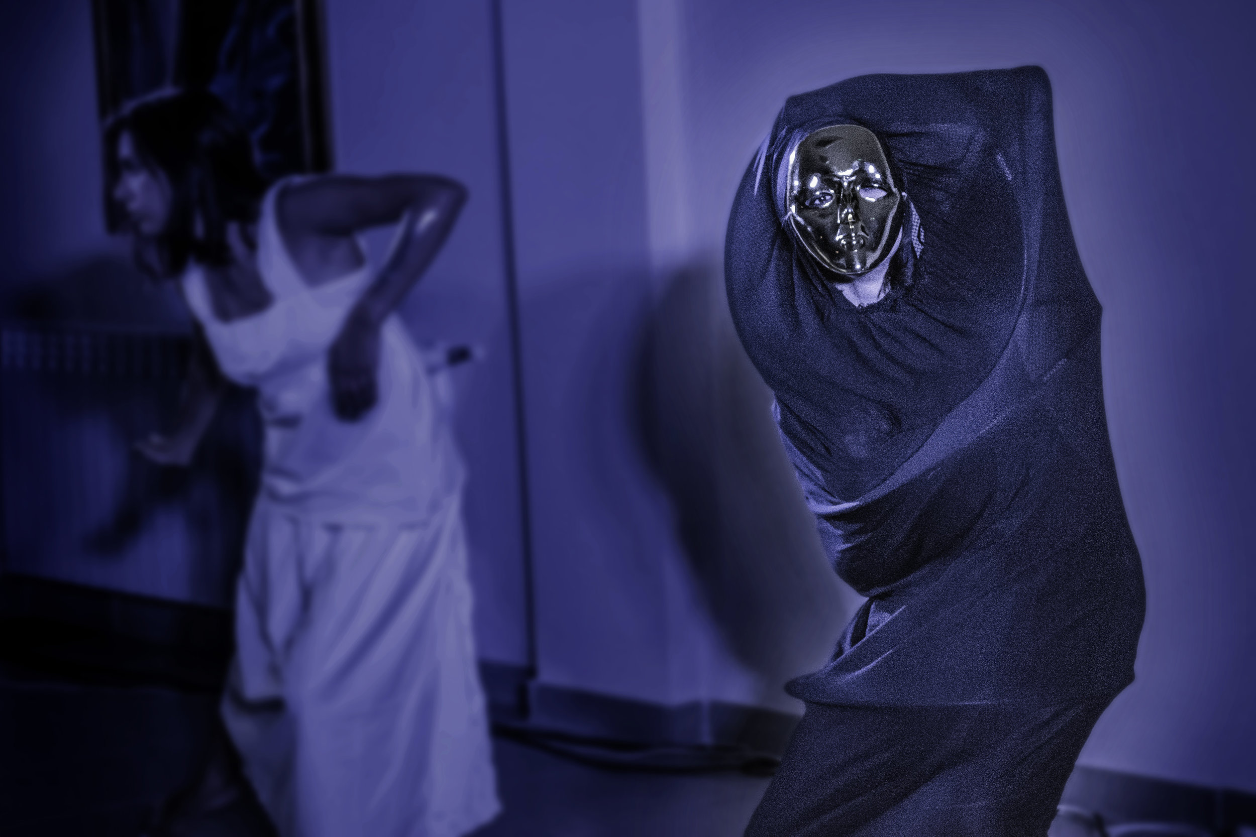
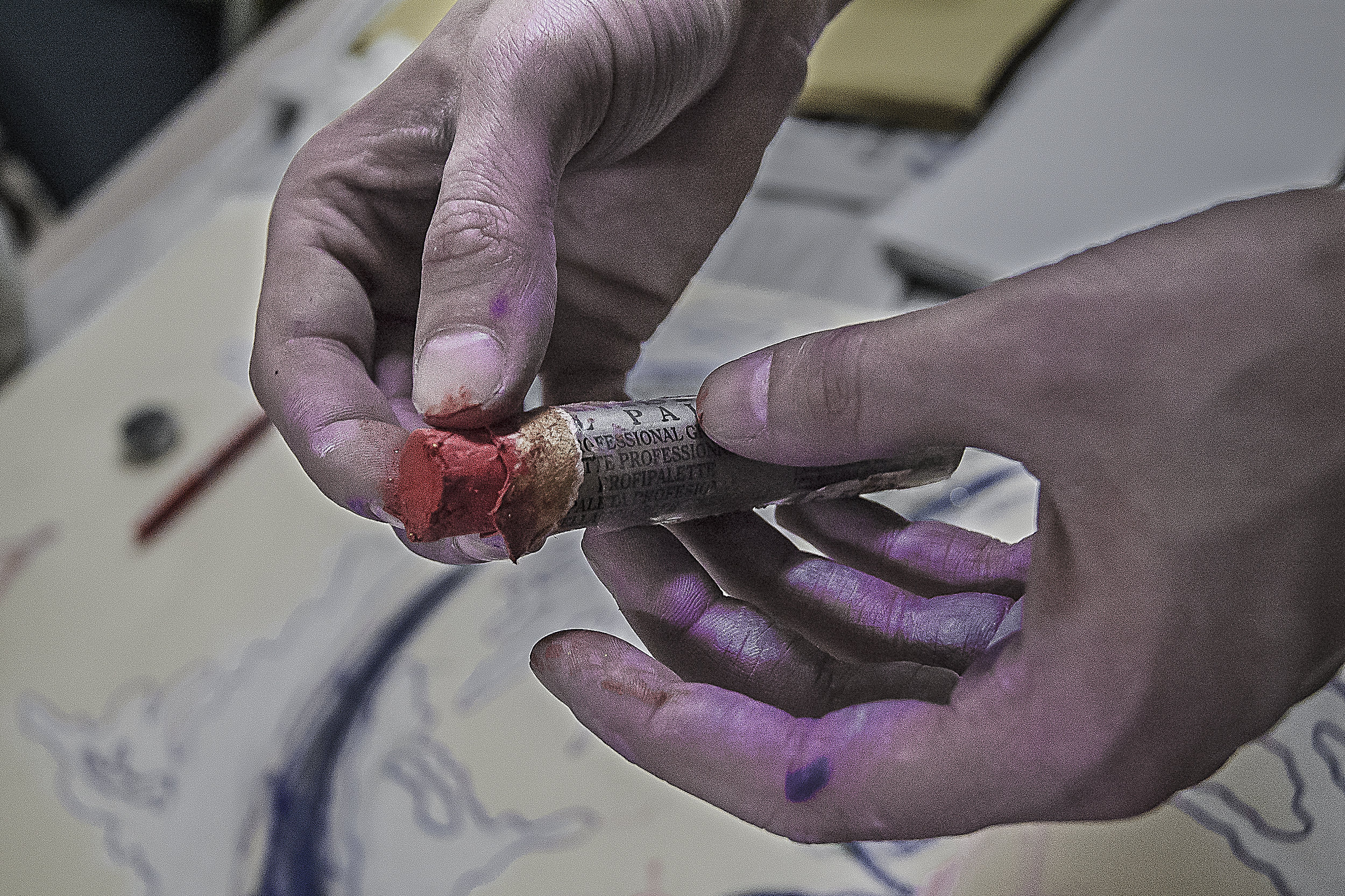
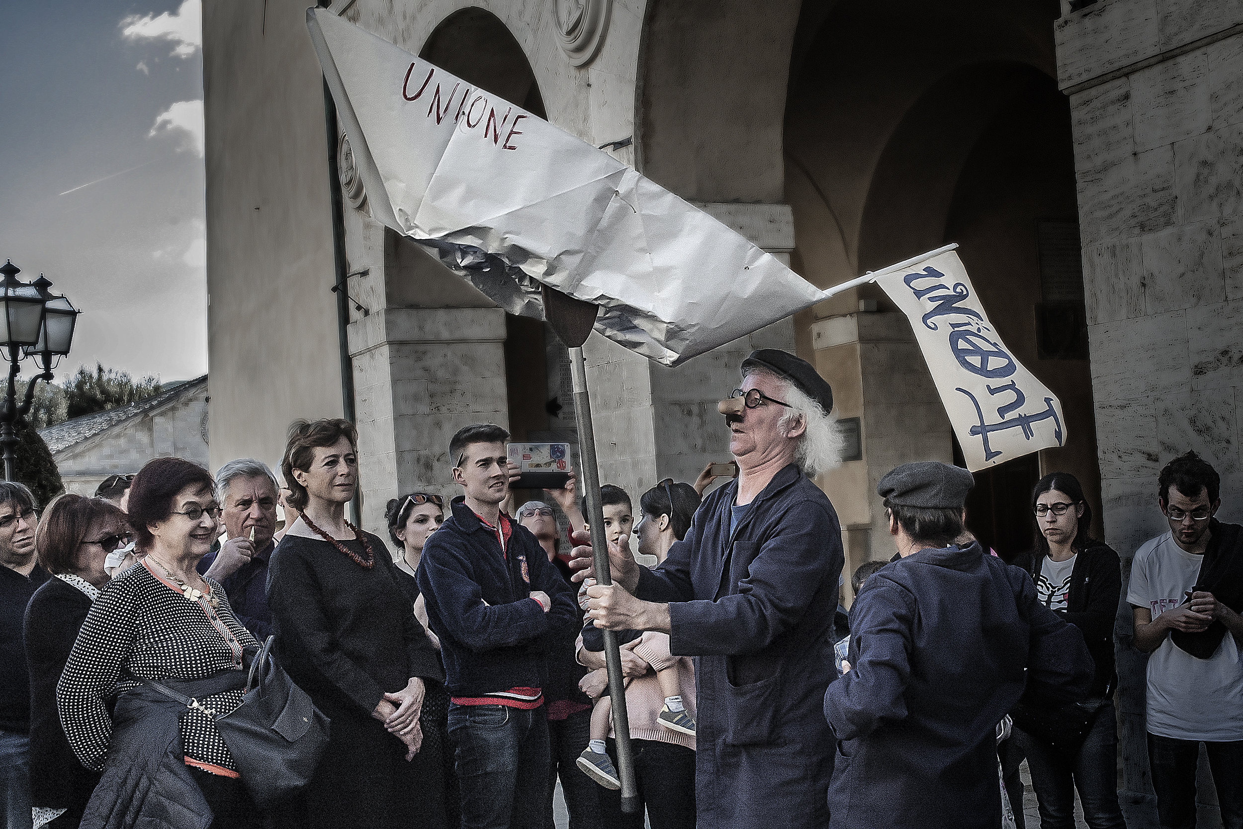
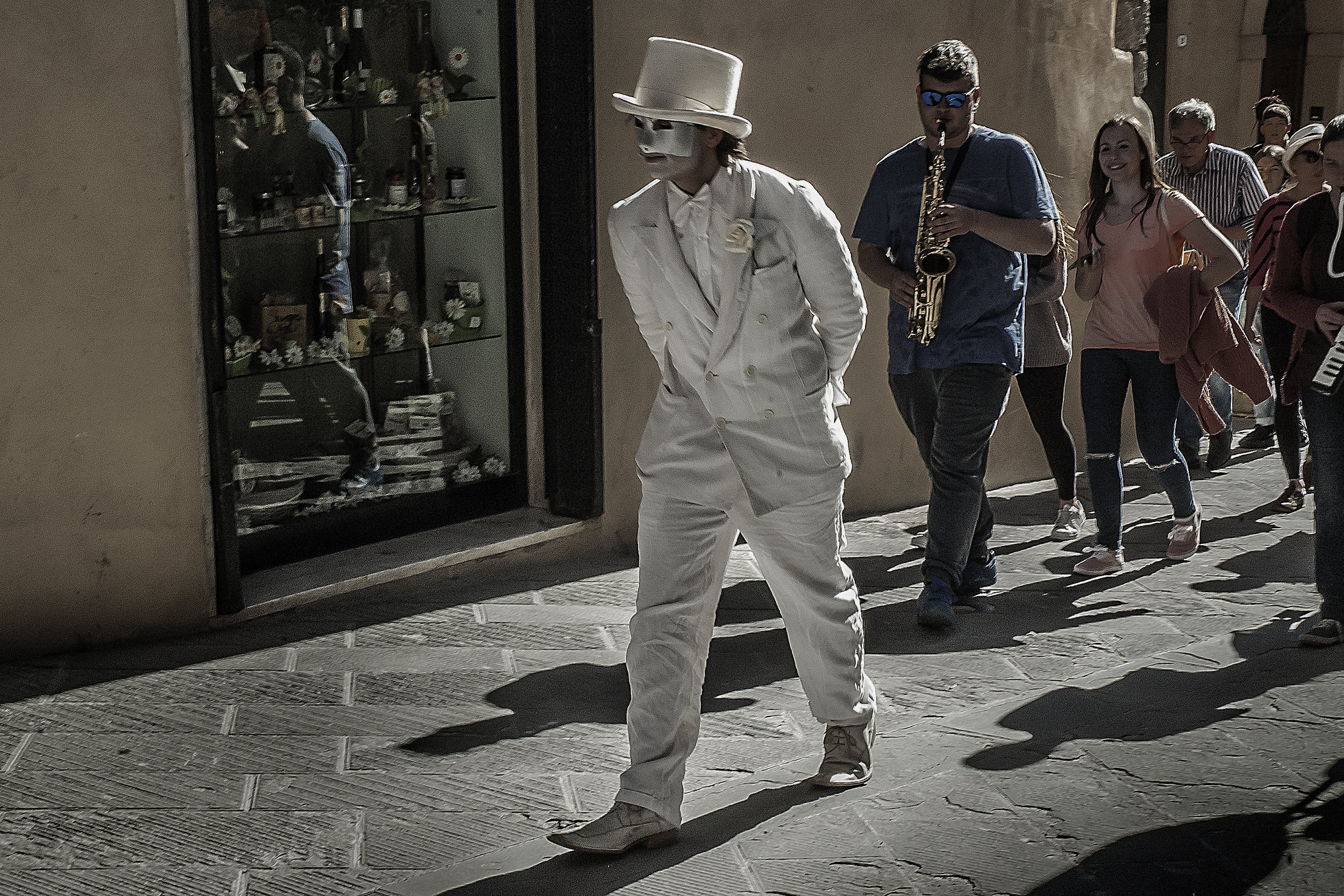
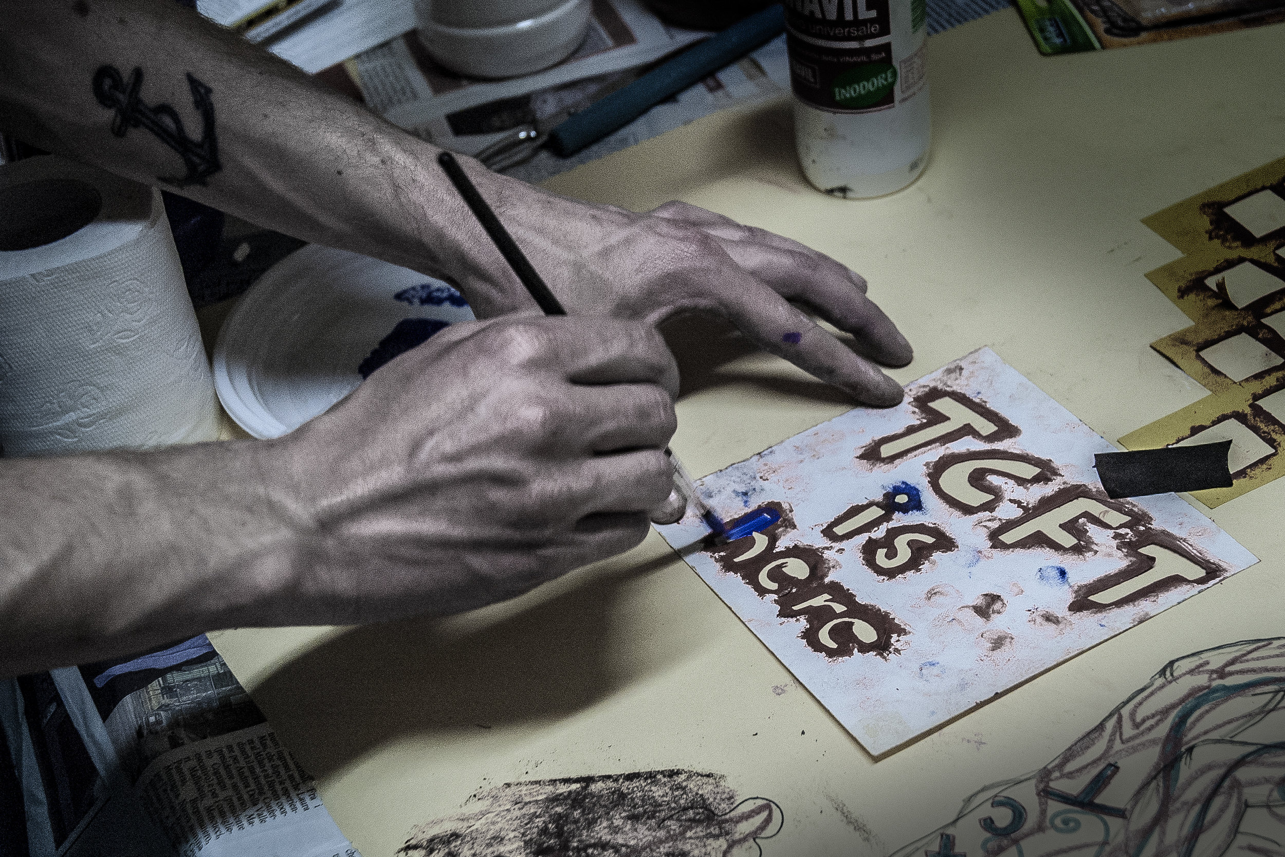
Art within TCFT has always been rooted in emotional truth: bold, spontaneous, and unfiltered. There's a kind of “organised chaos” that defines the creative outcomes of each residency: colorful murals, expressive performances, impromptu installations, and vibrant visual experiments that carry a shared pulse of authenticity.
The work created often becomes a refuge for unspoken truths. Each piece reflects the safe, inclusive environment TCFT fosters. It’s art that doesn’t need to be perfect; instead, it’s real. The visual language that emerges is energetic, joyful, powerful, and messy in the best possible way. Over the years, this evolving body of work has become a reflection of the freedom, happiness, and sense of belonging that TCFT embodies.


When I was given the opportunity to redesign the logo for TCFT, I knew the new identity had to be more than just a graphic, it had to FEEL like TCFT. It had to reflect the people, the memories, the energy, and the evolution of this unique environment.
At its heart, TCFT is about people coming together to collaborate and celebrate each other’s uniqueness in the pursuit of a more joyful, free, and just world. I wanted the new logo to embody that spirit.


The TCFT visual has taken many shapes over the years, molded by unique artists and participants. When redesigning the logo, it was important to tap into that legacy and craft a visual identity that would feel both familiar and forward thinking.


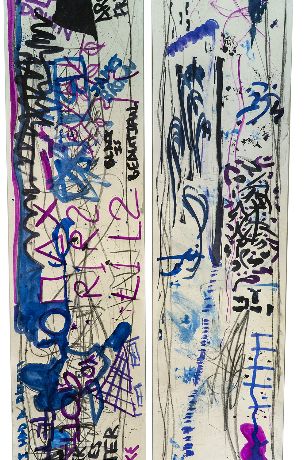
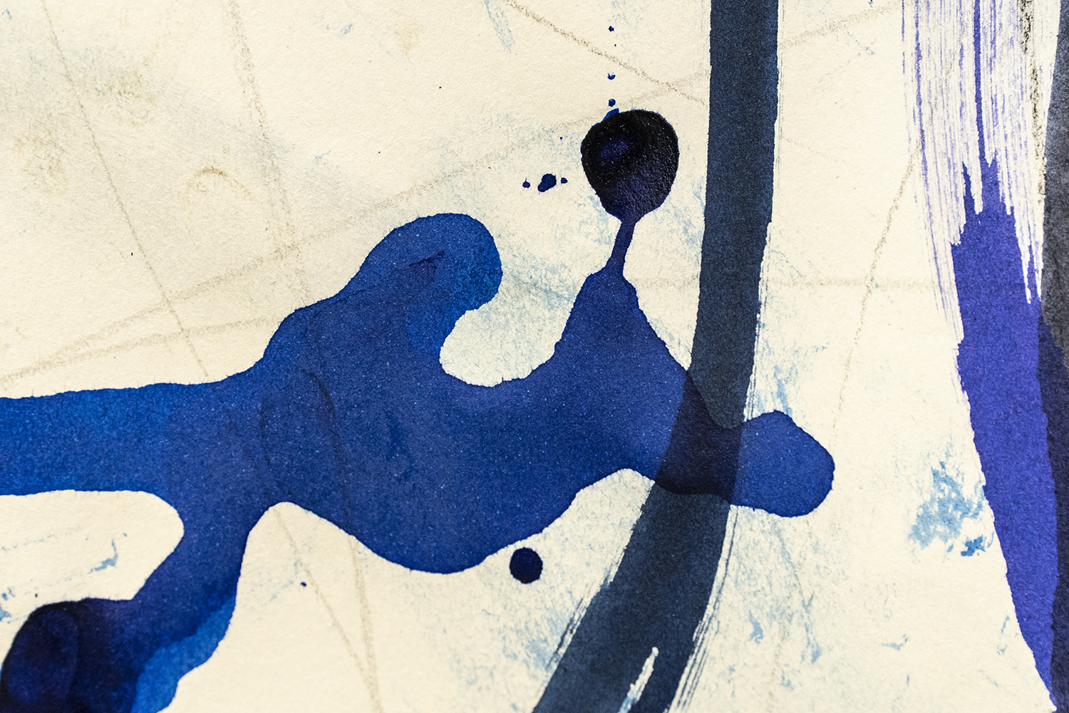
The primary inspiration for the logo was a specific piece of artwork created during a past residency by several participants which became a symbol for a moment, a feeling, a shared memory. Through referencing this piece, the logo becomes a visual gateway to that meaningful experience.

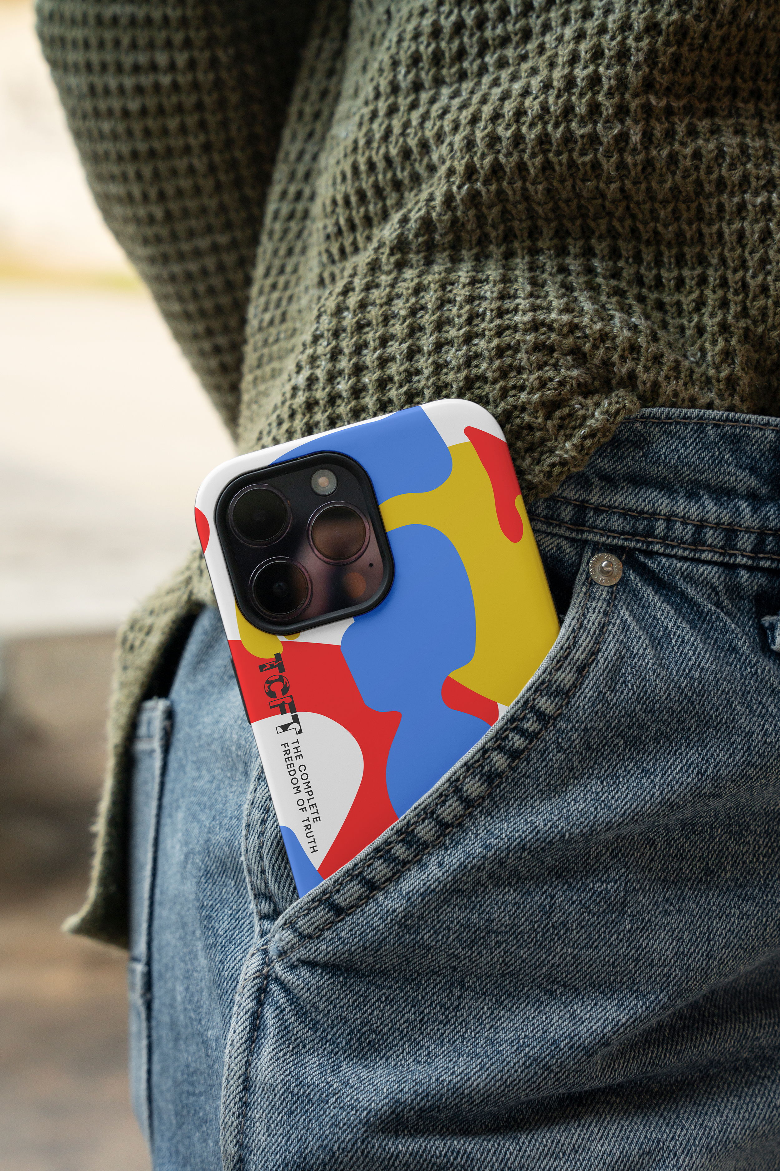
The decision to keep black as a base color was made as black conveys strength, maturity, and resilience, it also resonates deeply with youth culture and remains a foundational element of TCFT’s enduring visual language.
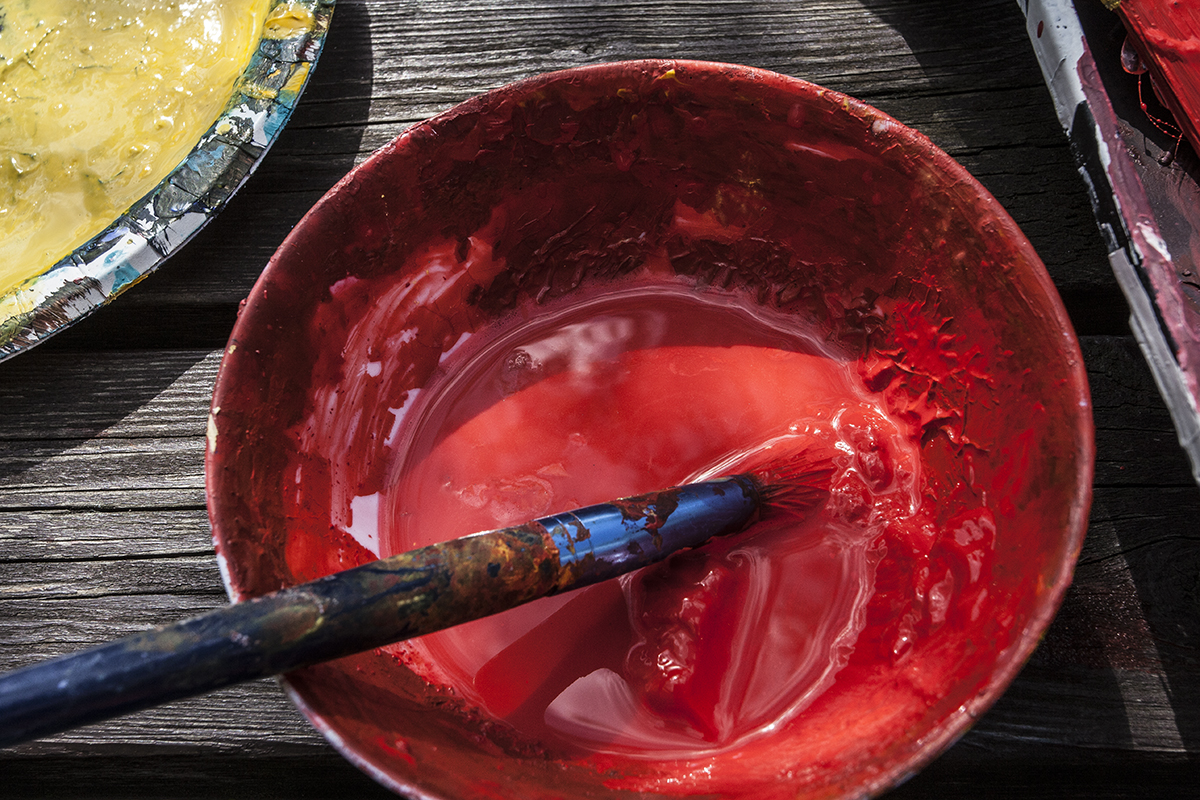
To contrast and uplift this, I included bright organic, "TRUTH" inspired shapes of primary colors: red, yellow and blue. These colours carry a raw and essential quality: They are the foundation of all other colours, just as creativity, truth & freedom are the foundation of TCFT.
The new logo is flexible, friendly, designed to live comfortably in different environments, on different surfaces, on any colours, within any boundaries. Like TCFT itself, it adapts, accommodates, fills any space with its presence & stands out through a strong visual.


It has been a true honor to not only be part of this living, breathing creative organism, but also to shape its new visual identity. My hope is that the face I’ve given this flowing, everchanging, creative entity will be recognized & proudly bared as a symbol of power, freedom & connection and that it will inspire new TCFT generations to express, create & thrive together.
Thank you!